


Barrier1 systems
CASE STUDY
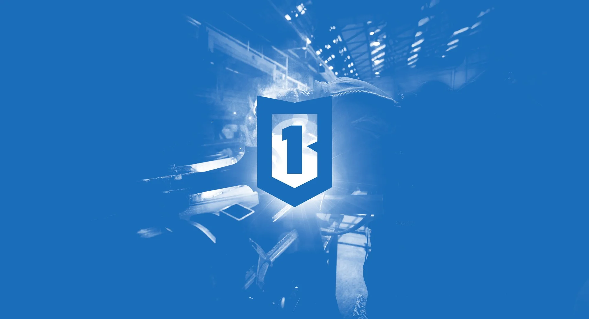
Barrier Manufacturing
Barrier1 provides anti-ram vehicle barrier solutions that protect people, property, and critical infrastructure. With a mission to strengthen perimeter security while building trust, Barrier1 Systems needed a rebrand that reflected their authority and reliability in the industry.
DELIVERABLES
Logo Design
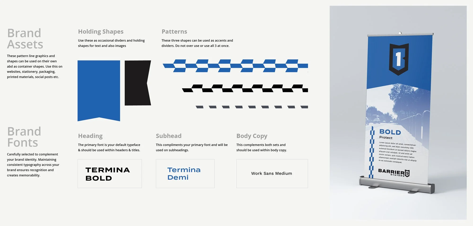
Visual Identity
Brand Guidelines
CHALLENGE
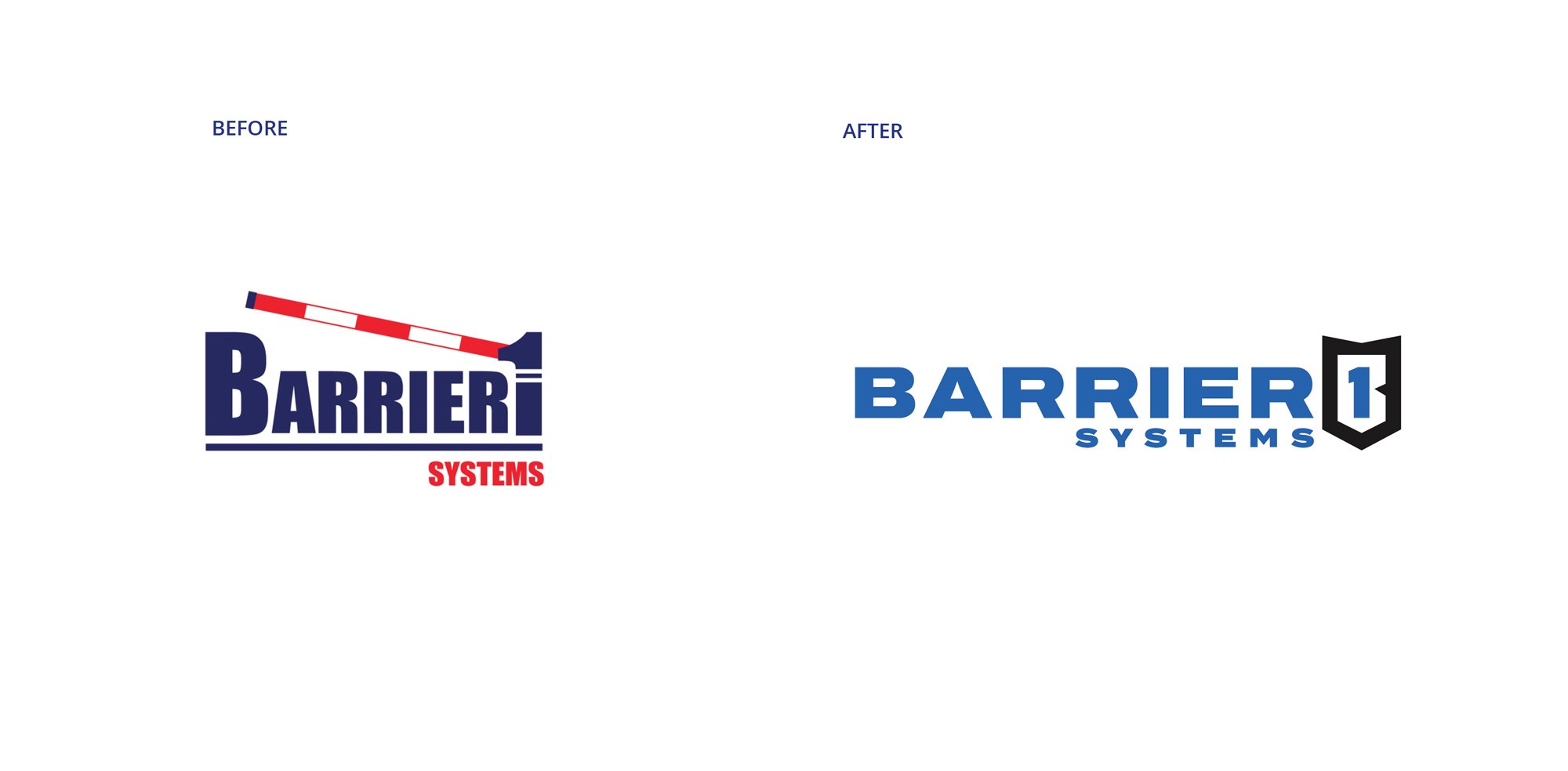
Refresh a dated logo into a strong, professional identity that military, government, and commercial clients would see as both authoritative
and trustworthy.
OUTCOME
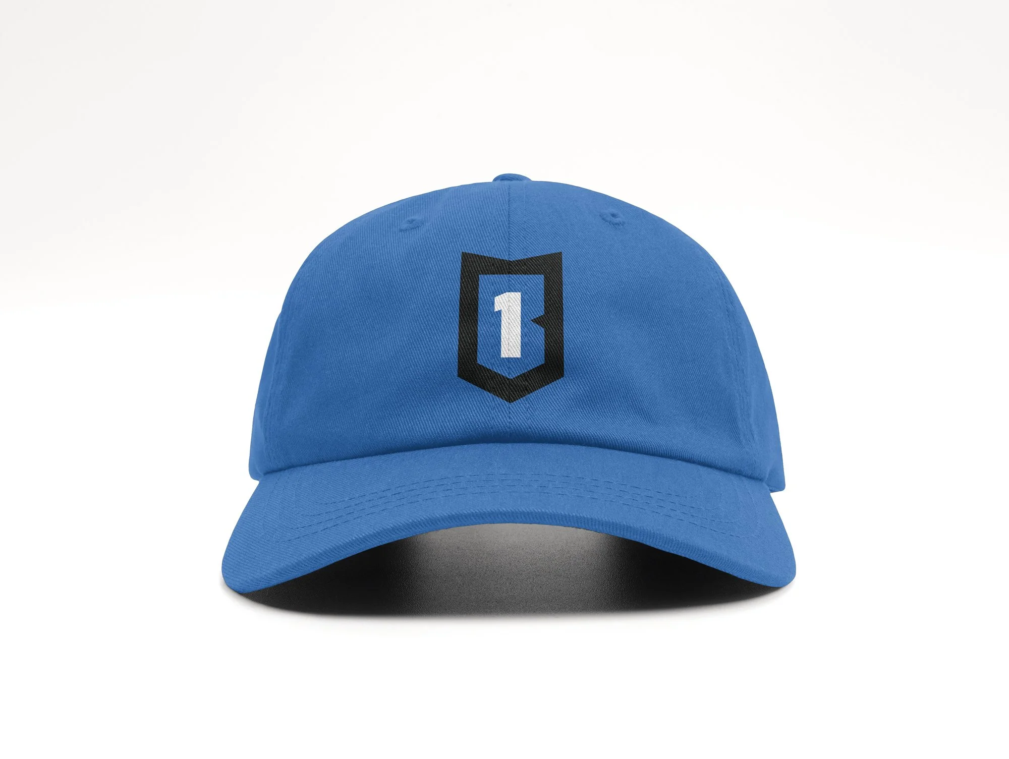
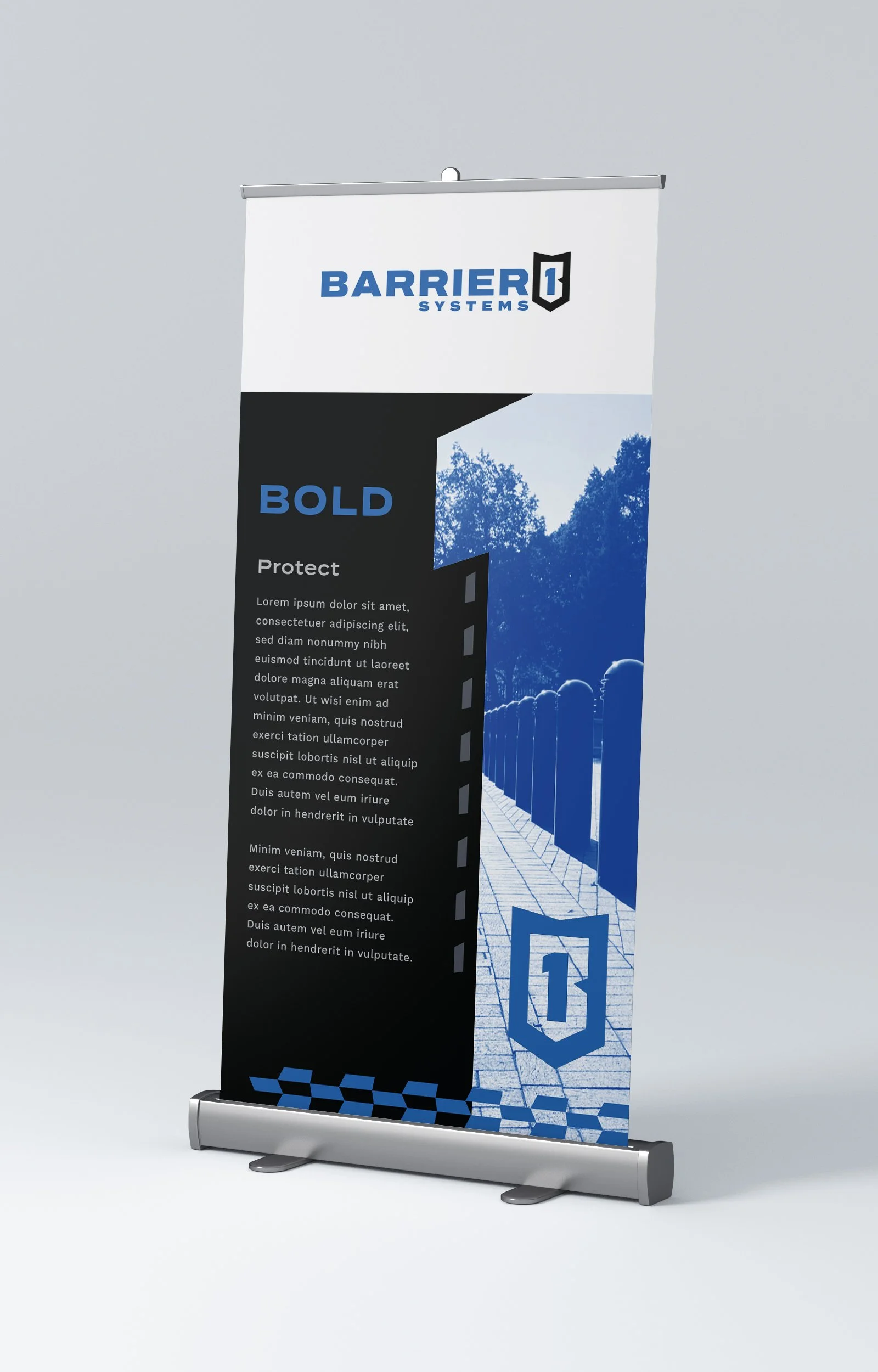
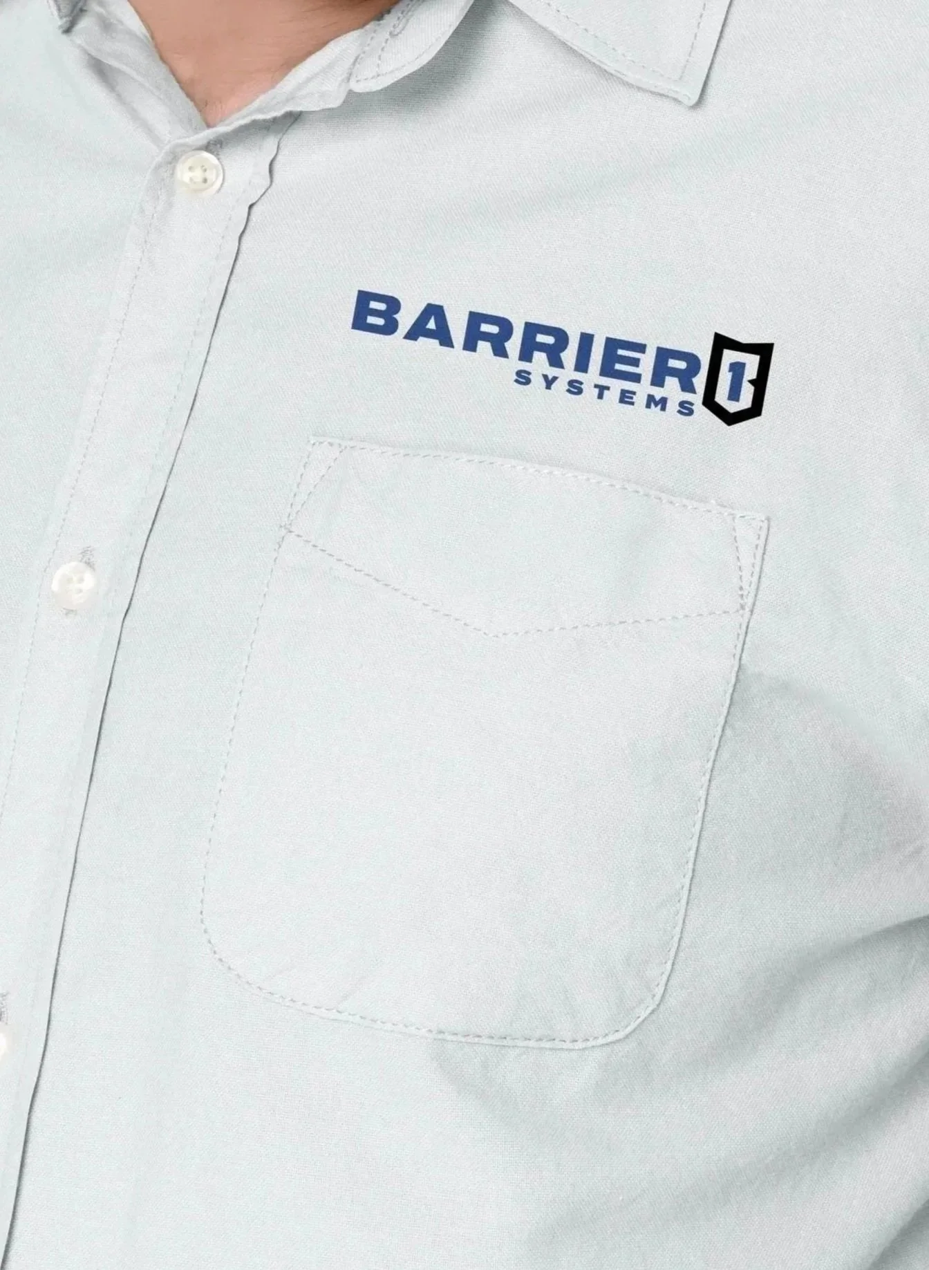
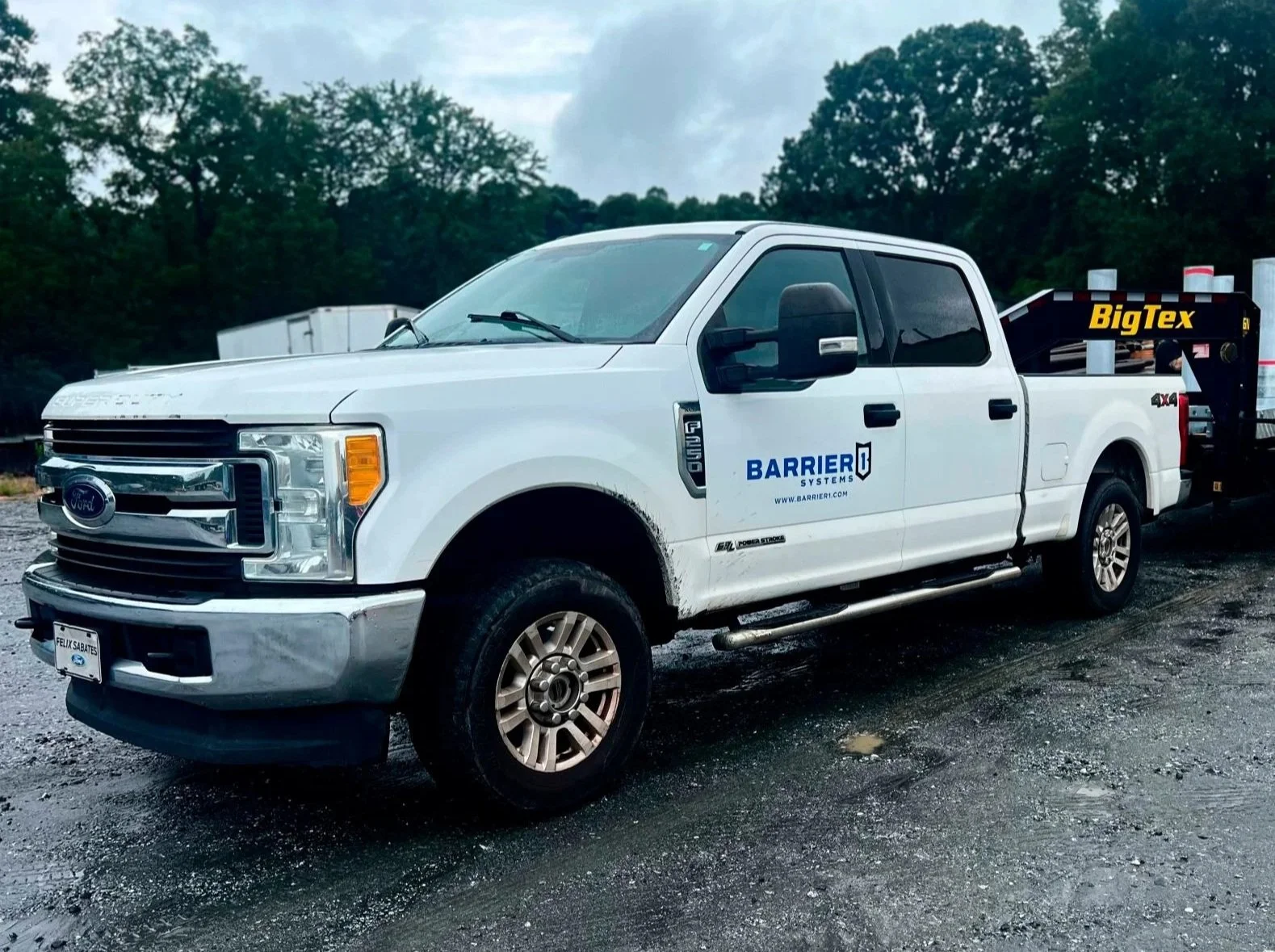
Barrier1 launched a bold new identity system with versatile applications across trucks, signage, trade shows, and more. The refreshed look was met with excitement from staff and clients, and continues to build confidence in their mission of protection and security as the move into a new facility and grow.

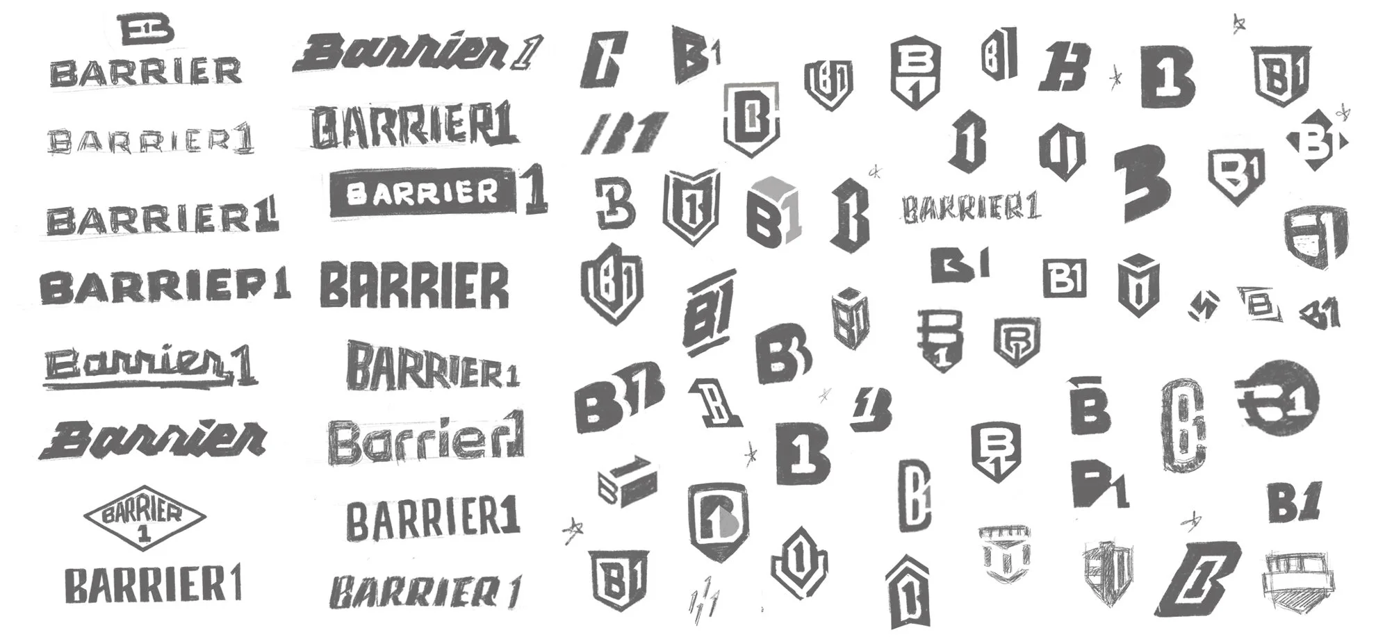
Strength in simplicity
Sketch Exploration
The sketch phase was all about finding a look that truly fit
who Barrier1 is today. They’ve grown far beyond the idea of
a single “barrier,” offering a wide range of custom security solutions. Early explorations focused on a clean, modern B1 mark that could carry the weight of the brand while staying simple and strong.
Alongside it, we tested type treatments that felt bold, sturdy, and versatile. These explorations gave Barrier1 a clear set of options to react to, making it easier to lock in on the mark that now represents their authority and innovation across every application.

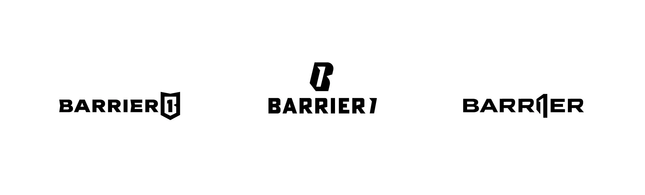

Outcome
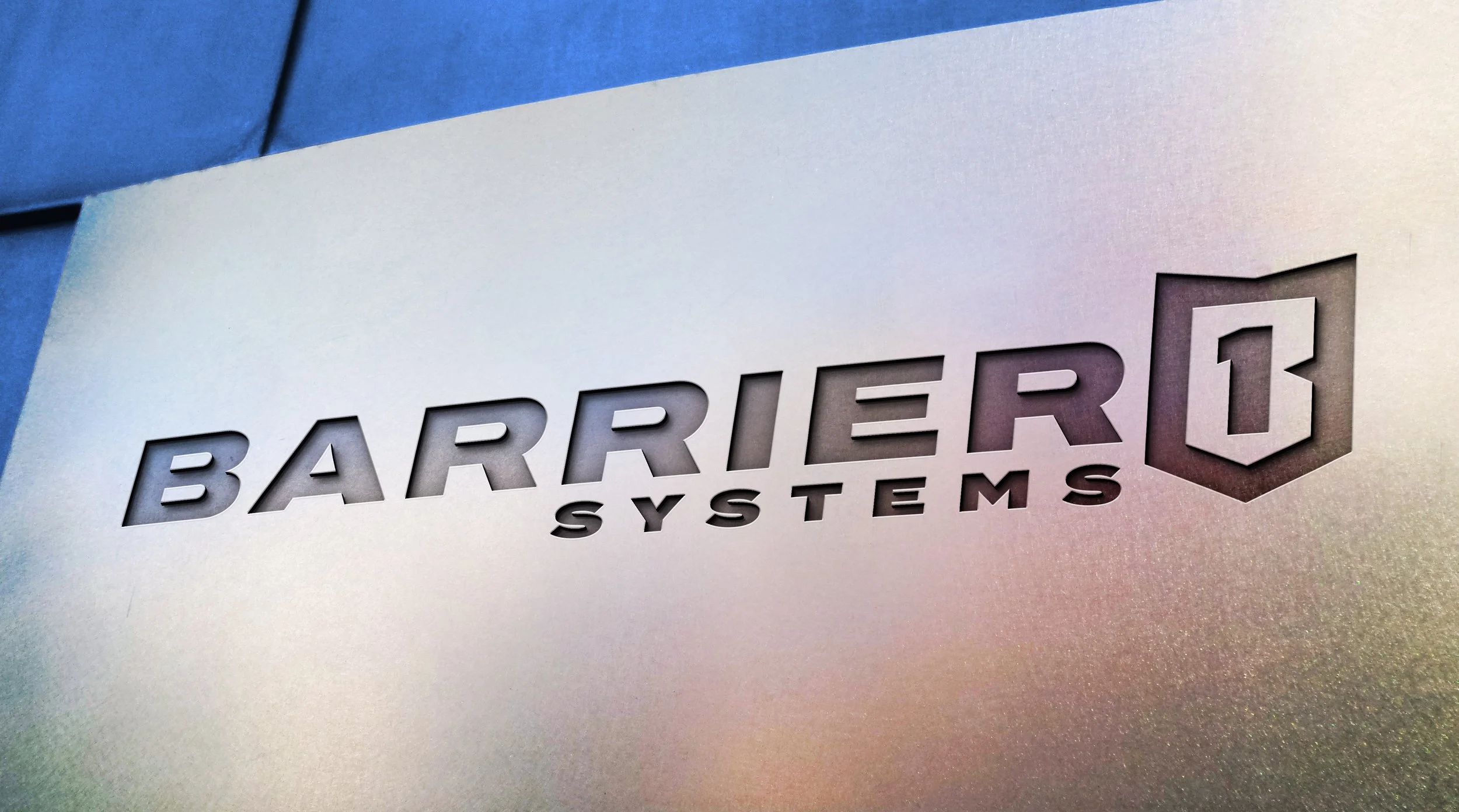
I worked with the Barrier1 team to create a modern, versatile logo system. The design features bold, industrial typography,
a refined red, white, and blue palette, and clear brand guidelines for consistent use. The new identity is flexible enough to live on everything from digital platforms to signage, trucks, and trade show displays.
Ready to elevate your business branding?